The Making of'It's Always Sunny Around Here'Chapter 4: Lockdown and Layout
To read this making-of guide as a downloadable ebook, click here for the EPUB and click here for the Kindle version (AZW). To look at and/or buy the book being discussed, head over to Amazon.
(Click on any of the images below to see the full-sized version.)
Like I mentioned before, there are two halves to the publishing process, a writing half and a design half. The moment you switch from one to the other is a moment called lockdown, which means that Author You is officially no longer allowed to keep tinkering on the Word file, no matter how tempted they are to do so. That’s because the manuscript has begun a process called its “production” into a finished paperback book; and now that your manuscript has been handed off to Designer You, who may never actually end up ever meeting Author You, any tinkering still done by Author You back in their Word file in their home office will not in any way actually be seen in the final paperback.
Here is maybe the biggest piece of advice I have for self-publishers, which might perhaps be called by others as my hottest take in this book: that if the goal is to learn as much software as you can, so to make the self-publishing process as fast and cheap as possible, minute for minute and dollar for dollar your best investment in time and money is in learning a sophisticated page layout program. And by that, I don’t mean those crappy “push a button and make a book” services that have grown so popular in the 2020s, but that by definition offer you an all-or-nothing experience where you either live with the arbitrary decisions the software made for you regarding theme, graphics, margins, typefaces, line spacing, character tracking, and sometimes even more, or you simply don’t have a book at all. Let’s do the briefest of historical looks at how this software developed, so that you’ll know exactly which apps I recommend and why.
Desktop publishing was invented in the early 1980s with Aldus Pagemaker, later acquired by Adobe. But even by the late 1980s, professional magazines and newspapers needed much more sophisticated software than this notorious clip art-heavy destination for party invitations and birthday cards; and Adobe’s competitor Quark stepped up with their XPress, which by the mid-1990s had captured a 95 percent market share of the desktop publishing industry. Adobe responded by retiring Pagemaker and introducing InDesign, which was essentially an exact clone of XPress, all the way down to the same keyboard shortcuts.
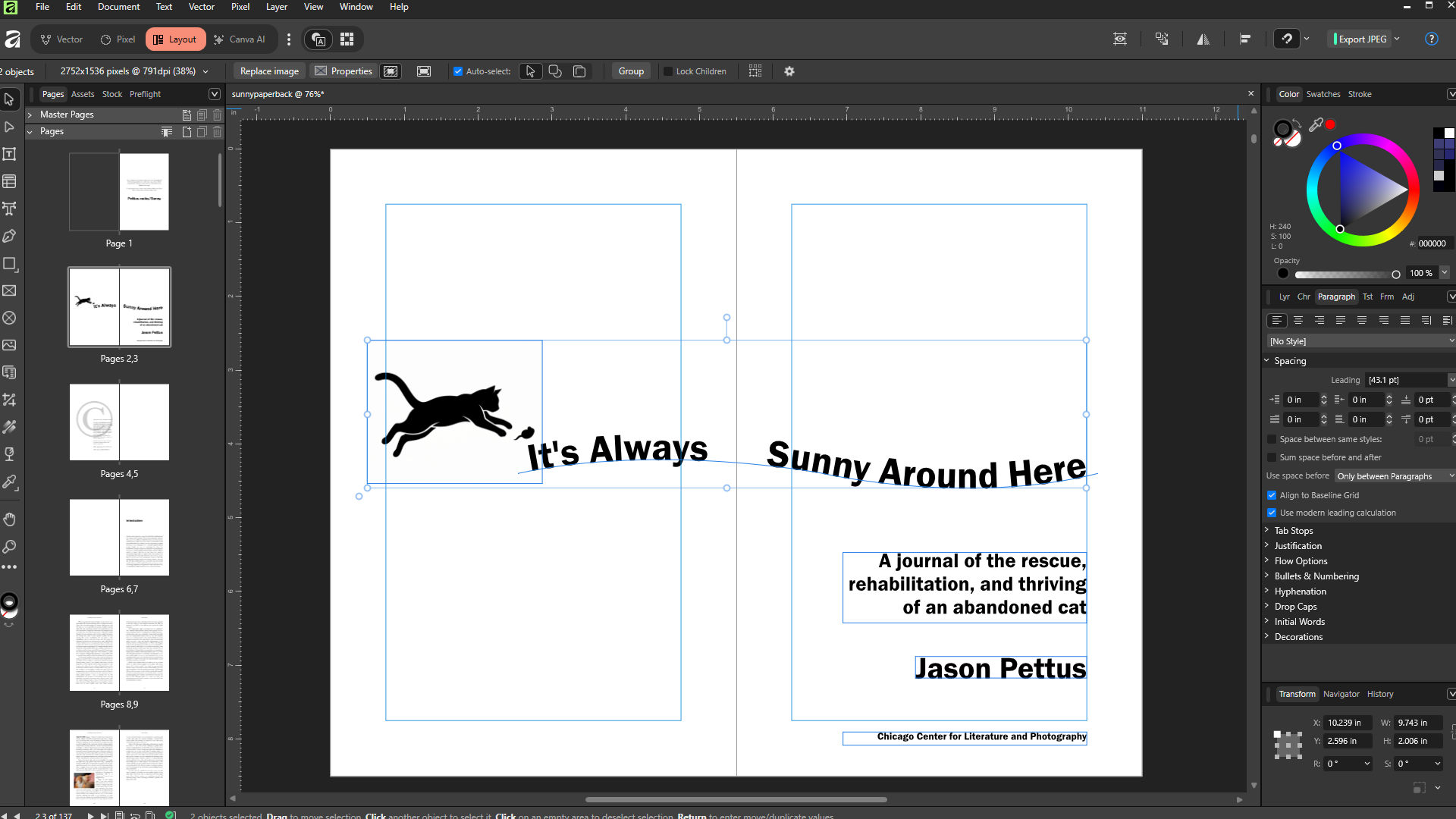
And that’s how it was for many years, with both companies eventually shooting the prices up to astronomical levels; but then in 2025, the online graphics service Canva acquired a smaller app called Affinity, whose main gimmick is that it’s an exact clone of Adobe’s Illustrator, Photoshop, and InDesign, all wrapped up in a single gigantic user interface. And Canva made the astounding decision to release Affinity completely for free after acquiring it, under the belief that they can make all their money by offering supplemental paid AI features for it. So here in spring 2026 when I’m writing these essays, while you can in theory go out and spend the $600 a year (that’s right, every single year) for access to InDesign, I instead strongly urge you to download Affinity for free, which I can now state with authority not only looks but feels and works exactly like InDesign, all the way down to being able to open InDesign files.
This program is complicated, which is the whole point; you have detailed, fine-tuned control over every single detail you could possibly ever imagine or name, which to do so involves hundreds of tools and hundreds of keyboard shortcuts, dozens of panels that each have multiple side menus, a veritable second monitor full of supplemental UI elements besides just the big blue-line-covered rectangle that represents your finished pages. The good news, though, is that it’s easier to ever to learn this kind of software for free, now that YouTube has become a viable commercial streaming service, and people can make decent money from ad sharing revenue for content of high quality. I did literally five seconds of searching there one day and immediately found a 20-part free online class in Affinity, that taught me literally every single tool and also got me up to speed on 500 years of printing-press standards and lingo. Just imagine what ten minutes of searching will get you.
I’ll let you learn about typographic style and norms on your own, but I can tell you about some of the common things I see my clients miss all the time. For example, don’t say, “© Copyright 2026, Author You;” either use the copyright symbol or say “copyright,” but don’t do both. (The symbol literally means “copyright,” so in this situation you’re actually saying, “Copyright copyright 2026.”) The first paragraph of every new chapter and every new scene gets no automatic paragraph indent. If you want to look classy, boldface the first three or four words of a new chapter, or learn your software well enough to add drop caps. Learn the difference between front matter (like the title page, the introduction, etc.), the main body text, and the back matter (like the author bio or an index), and how to properly paginate them. Teach your brain to look for paragraphs that end with a single word on a line by itself; then teach yourself to use character spacing to subtly get rid of these dangling words. Your acknowledgements go at the end, not the beginning; your dedication goes at the beginning, not the end. You don’t list “Table of Contents” in the table of contents. All sections of all books start on the right-hand page.
This is known as the interior design of the book; but at the same time, you’re designing the cover art, which will wrap around the interior on a folded piece of cardstock thicker than the inside pages. If you’re going to spend money on anything, it should probably be this; but we’ll talk about that in the next chapter.